
Frontline Education Rebrand
Overview
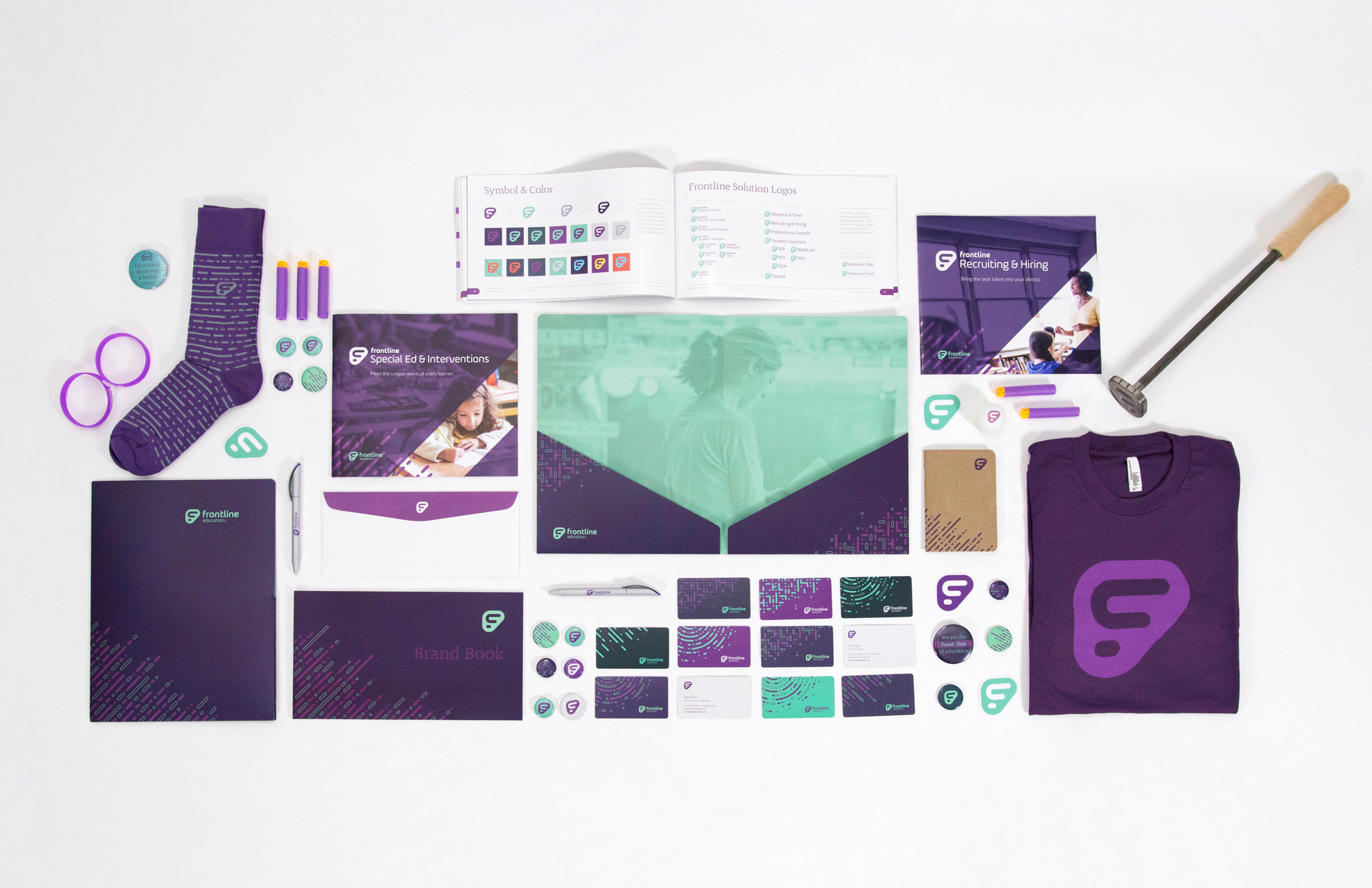
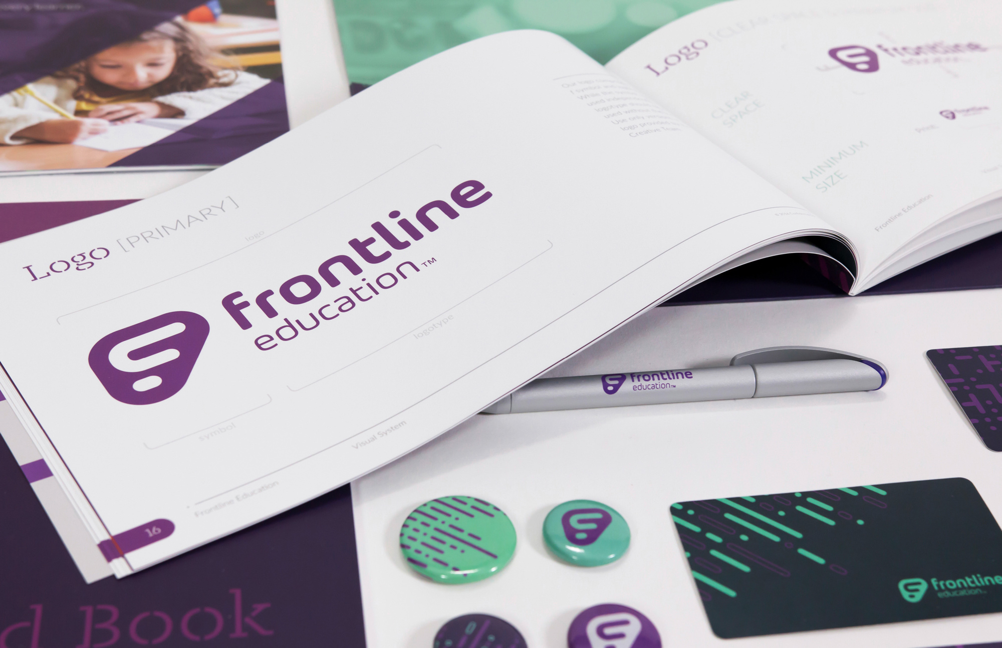
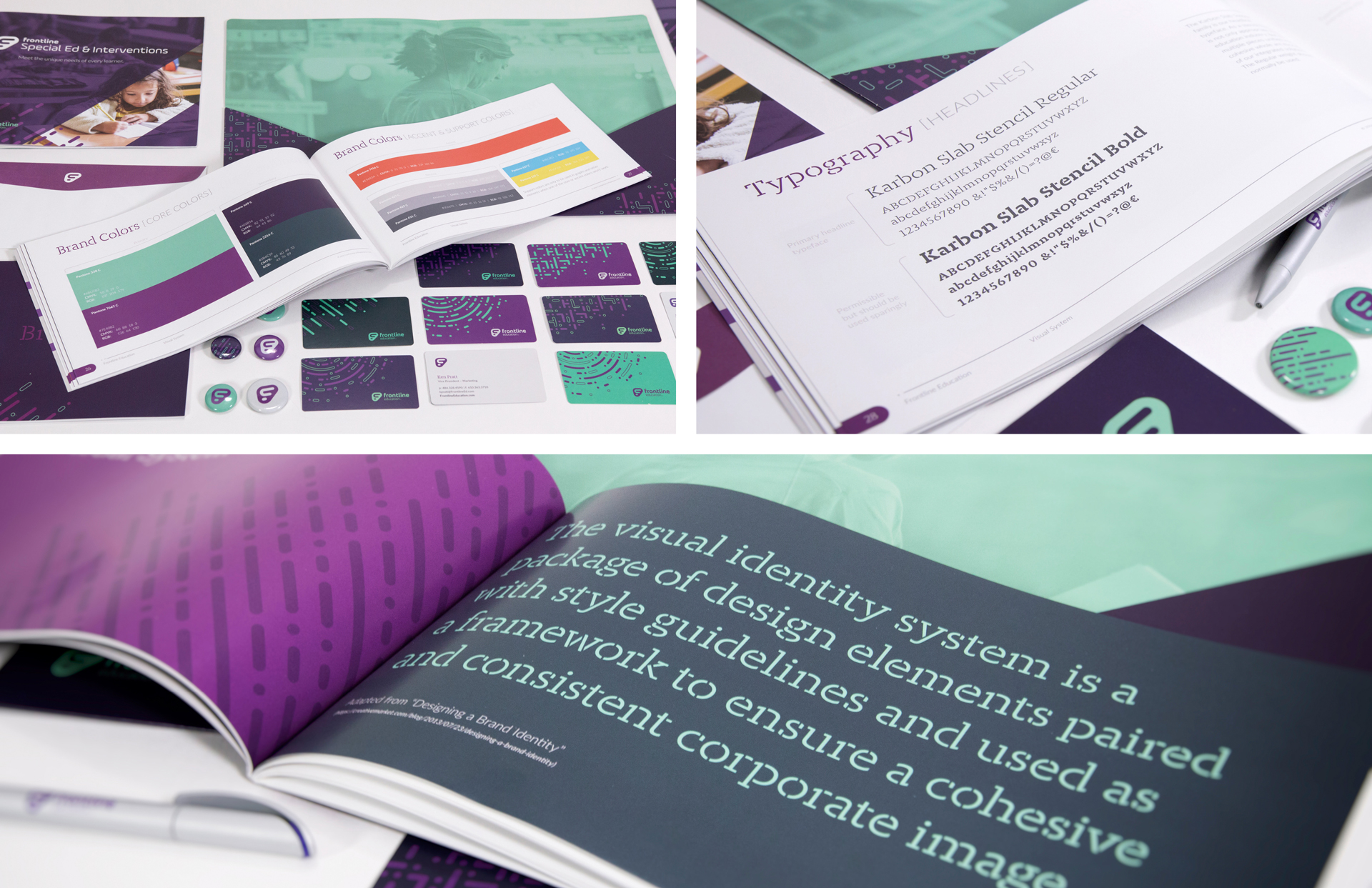
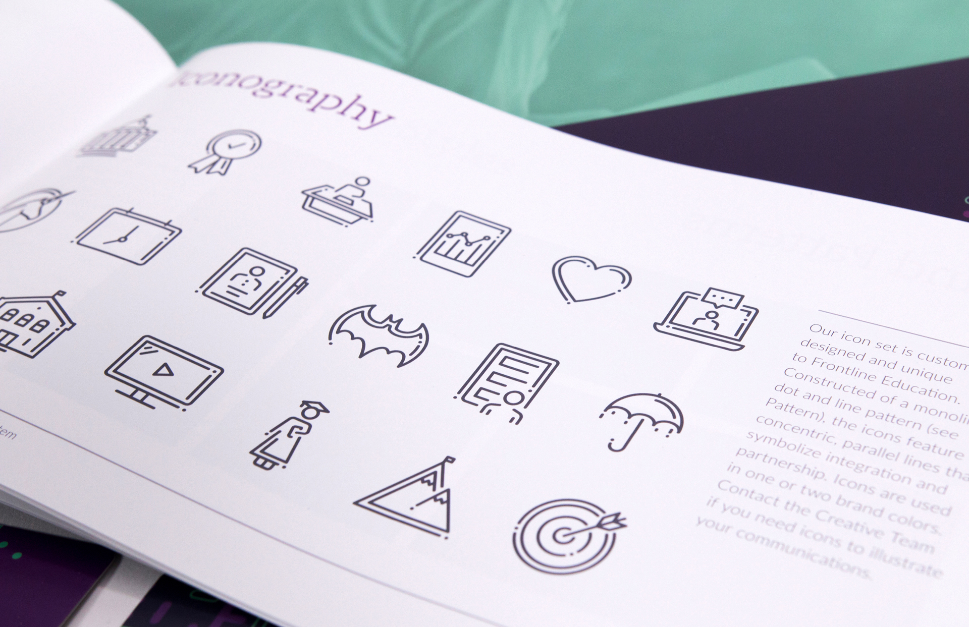
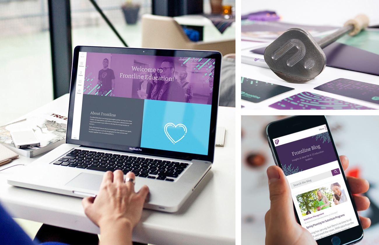
Redesign a 15-year-old tech company's visual brand. Frontline had evolved and had multiple product brands from acquisitions (10 companies in 2 years). We needed a visual brand that stood out from the competition, resonated with our customers, and united all of our product brands under one brand.
A major challenge was competing with an agency that wanted to do the work. Our in-house team won the project and did an extensive rebrand which included renaming our company, logo, colors, product names, messaging, tone, and all visuals.
My role was to design all the key elements, help pitch the system to key stake holders, direct the design of on going collateral, and curate all additional "swag" elements of the brand launch.
Within a year of launching the new brand, Frontline was purchased for over $1 Billion and became the first "Unicorn" company in Pennsylvania.
Role:
Lead Designer and Art Director
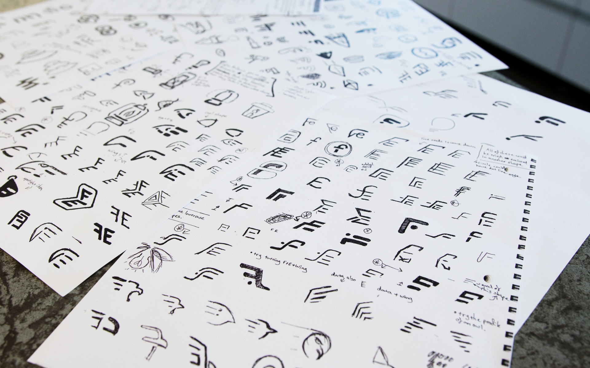
The above sketches are my own and a key part of my design process. During the logo design stage of the rebrand, all 4 designers on our team came up with hundreds of options. One of my logos was chosen as the final version.
About Me
I'm a Creative Director and multi-disciplinary Designer with a passion for making brands come to life. I have over 15 years of design, creative direction, and marketing experience in both agency and in-house settings.
© 2025 Jon Pope. All rights reserved.